Color plays a critical role in design, branding, and user experience. Whether you are designing a website, creating a brand identity, or planning marketing visuals, understanding Warm Vs Cool Colors can dramatically improve how your audience perceives and interacts with your content. Colors are not just visual elements; they influence emotions, decisions, and behavior.
In this guide, we’ll explore Warm Vs Cool Colors, their key differences, psychological impact, and the most effective methods to combine them for balanced, high-converting designs.
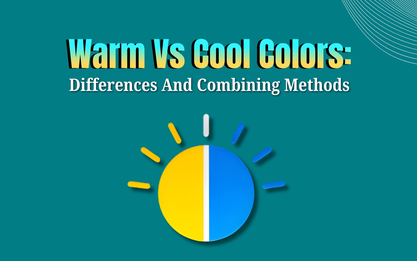
Understanding Warm Vs Cool Colors
Before diving into differences and usage, it’s important to understand what Warm Vs Cool Colors actually mean.
Warm colors are associated with heat, energy, and passion. These include:
- Red
- Orange
- Yellow
- Warm shades of pink and brown
Cool colors are associated with calmness, trust, and relaxation. These include:
- Blue
- Green
- Purple
- Cool shades of gray
The concept of Warm V/s Cool Colors comes from the color wheel, where warm tones sit on one side and cool tones on the opposite side. Each group communicates a different emotional message to the viewer.
Psychological Impact of Warm Vs Cool Colors
One of the most important differences between Warm Vs Cool Colors lies in how they affect human psychology.
Warm Colors: Energy and Action
Warm colors naturally draw attention. They create feelings of excitement, urgency, and warmth. That’s why they’re often used for:
- Call-to-action buttons
- Promotional banners
- Sales and discount sections
For example, red can create urgency, while orange feels friendly and energetic. In Warm V/s Cool Colors, warm tones are typically used when you want users to act quickly.
Cool Colors: Trust and Stability
Cool colors evoke calm, trust, and professionalism. Brands in healthcare, finance, and technology often rely on cool tones because they:
- Reduce visual stress
- Increase perceived reliability
- Encourage longer engagement
In the Warm Vs Cool Colors comparison, cool colors are ideal for backgrounds, content-heavy layouts, and trust-focused branding.
Key Differences Between Warm Vs Cool Colors
Understanding the differences between Warm V/s Cool Colors helps designers use them strategically rather than emotionally.
1. Emotional Tone
- Warm colors feel energetic, bold, and emotional
- Cool colors feel calm, controlled, and professional
2. Visual Weight
- Warm colors appear closer and more dominant
- Cool colors feel distant and subtle
This difference is crucial when deciding layout hierarchy in web or UI design.
3. User Attention
- Warm colors attract immediate attention
- Cool colors support focus and readability
In Warm Vs Cool Colors, warm shades work best for highlights, while cool shades support structure.
Warm Vs Cool Colors in Branding
Brand identity heavily depends on color psychology. Choosing between Warm V/s Cool Colors can define how your brand is perceived.
When to Use Warm Colors in Branding
Warm colors work best for brands that want to appear:
- Energetic
- Youthful
- Passionate
- Action-oriented
Industries that often use warm colors include:
- Food & beverage
- Fitness & sports
- Entertainment
- E-commerce promotions
When to Use Cool Colors in Branding
Cool colors are ideal for brands that want to communicate:
- Trust
- Security
- Calmness
- Expertise
Industries that prefer cool tones include:
- Tech companies
- Medical and healthcare
- Finance and SaaS
- Corporate services
In Warm Vs Cool Colors, the right choice depends on brand personality, not trends.
Warm Vs Cool Colors in Web and UI Design
In modern web design, balancing Warm Vs Cool Colors is essential for usability and conversions.
Warm Colors for Conversion Elements
Warm tones are commonly used for:
- CTA buttons
- Sale badges
- Notifications
- Alerts
They naturally stand out against cooler backgrounds, making them perfect for user actions.
Cool Colors for Layout and UX
Cool colors are widely used for:
- Backgrounds
- Navigation menus
- Content sections
- Dashboards
When applying Warm Vs Cool Colors correctly, users feel comfortable while still being guided toward action.
Combining Warm Vs Cool Colors Effectively
One of the biggest design challenges is combining Warm Vs Cool Colors without overwhelming users. Here are proven methods to do it right.
1. Use the 80/20 Rule
- 80% cool colors for structure and background
- 20% warm colors for highlights and actions
This approach ensures visual balance while keeping CTAs noticeable.
2. Anchor With Neutral Colors
Neutral colors like white, gray, and black help bridge Warm Vs Cool Colors. They prevent visual conflict and improve readability.
3. Match Color Temperature With Purpose
- Use warm tones for urgency and promotions
- Use cool tones for trust and information
In Warm Vs Cool Colors, intention matters more than aesthetics.
4. Test Contrast and Accessibility
Always ensure proper contrast between warm and cool tones. Poor contrast can harm readability and accessibility, especially on mobile devices.
Common Mistakes When Using Warm Vs Cool Colors
Even experienced designers make mistakes with Warm Vs Cool Colors. Avoid these common issues:
- Using too many warm colors, causing visual fatigue
- Overusing cool colors, making the design feel cold or boring
- Ignoring brand personality
- Not testing colors across devices and lighting conditions
A successful Warm Vs Cool Colors strategy is balanced, intentional, and user-focused.
Warm Vs Cool Colors in Marketing and Advertising
Marketing visuals rely heavily on emotional triggers, making Warm V/s Cool Colors especially important.
- Warm colors increase click-through rates in ads
- Cool colors increase trust on landing pages
- Combining both improves overall conversion performance
For example, a landing page might use a cool blue background for trust, paired with a warm orange CTA button for action. This is a classic and effective Warm Vs Cool Colors combination.
Final Thoughts on Warm Vs Cool Colors
Understanding Warm Vs Cool Colors is not just a design skill—it’s a strategic advantage. Warm colors drive emotion and action, while cool colors build trust and clarity. When combined correctly, they create visually appealing, user-friendly, and high-converting designs.
Whether you’re building a brand, designing a website, or creating marketing assets, mastering Warm V/s Cool Colors will help you communicate more effectively and stand out in a competitive digital landscape.
👉 Contact us to design your stunning website that converts.