Color is the heartbeat of great design. It defines personality, builds emotion, and silently tells your brand’s story long before a single word is read. In web design, mastering color is not just an art—it’s a science that shapes perception, usability, and engagement.
Yet, choosing the right colors consistently across digital projects can be tricky. That’s where a Best Color Picker Tool becomes a designer’s best friend. It transforms how professionals select, test, and apply colors—making the entire creative process smoother, faster, and more precise.
In this article, we’ll dive into how color picker tools elevate web design, explore their importance, and reveal how modern designers use them strategically to craft memorable digital experiences.
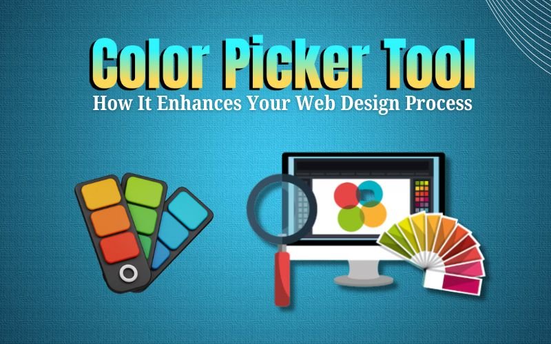
What is a Color Picker Tool?
A Best Color Picker Tool is a digital assistant that allows designers to select exact shades and color values for their projects. It provides precise color codes—like HEX (#1A73E8), RGB (26, 115, 232), or HSL (217°, 83%, 51%)—ensuring accuracy across screens and design platforms.
Modern color pickers integrate seamlessly with browsers, design software, and coding environments. Whether you’re capturing a hue from a photo, matching a brand color, or testing UI contrast, these tools ensure visual consistency without guesswork.
The Importance of Color in Web Design
Color is not just aesthetic—it’s strategic. Every shade influences how users feel, navigate, and connect with your website.
- Brand Identity
Color builds instant recognition. Think of the trust evoked by blue in fintech brands or the excitement of red in fast food chains. Strategic color selection strengthens your visual identity and sets you apart in a crowded digital space. - User Experience (UX)
A well-chosen palette enhances usability. Designers use color to guide attention, define hierarchy, and highlight calls-to-action. Consistent use of color reduces cognitive load and helps users navigate effortlessly. - Accessibility
Inclusive design starts with color. Proper contrast ensures text readability for users with visual impairments or color blindness. Following WCAG (Web Content Accessibility Guidelines) is not optional—it’s essential.
With color being this influential, precision becomes non-negotiable. That’s where a color picker tool adds immense value.
How a Best Color Picker Tool Enhances Your Web Design Process
A Color Picker Tool doesn’t just make your job easier—it makes your results better. Here’s how:
- Pixel-Perfect Precision
Designers can extract, adjust, and reuse colors with exact codes, guaranteeing visual uniformity across every page and device. - Speed and Efficiency
Previewing color combinations instantly saves time otherwise lost in trial-and-error testing. It streamlines design revisions and client feedback cycles. - Seamless Collaboration
Color palettes can be shared with developers and brand teams, ensuring consistent execution from design to deployment. - Accessibility Confidence
Many tools include contrast analyzers that validate whether your chosen palette meets accessibility standards—helping you design for all audiences.
Essential Tips for Using a Color Picker Tool
- Integrate with Your Workflow: Use color pickers that sync with your design platforms (e.g., Figma, Adobe XD, or Chrome Extensions).
- Organize Color Palettes: Save custom palettes for different brands or projects to ensure quick access and consistency.
- Always Test Contrast: Verify foreground and background colors for WCAG compliance and readability.
- Apply Color Psychology: Choose colors that align with your client’s brand tone and evoke the right emotional response.
- Stay Consistent: Document your color system (primary, secondary, accent) to keep your design cohesive.
✅ Read More: Best UI Animation Tools for Great Modern Designs
Top Features to Look For in a Color Picker Tool
When selecting a Color Picker Tool, focus on features that enhance accuracy and usability:
- Multi-format Support: HEX, RGB, HSL, and CMYK compatibility.
- Palette Management: Create, export, and organize multiple color collections.
- Contrast Checker: Built-in WCAG accessibility validation.
- Eyedropper Function: Pick colors from any on-screen element.
- Integration Options: Works with browsers, design software, or coding editors.
These capabilities help designers deliver consistent, professional-grade visual experiences every time.
Mistakes to Avoid When Using a Color Picker Tool
Even the best tools can’t fix bad habits. Avoid these common mistakes:
- Using Too Many Colors
Overly complex palettes can distract users. Stick to 2–3 primary hues and supporting neutrals for clarity. - Ignoring Accessibility
A beautiful design means little if users can’t read it. Always check contrast ratios before launch. - Forgetting Brand Consistency
Deviating from established brand colors weakens recognition. Keep your palette aligned with identity guidelines. - Skipping Device Testing
Colors may vary across screens. Test them on both mobile and desktop for accuracy.
How GrewDev Uses Color Strategy
At GrewDev, color is more than design—it’s strategy. Our team leverages advanced Color Picker Tools and color psychology to craft digital experiences that connect emotionally and convert effectively.
We analyze audience behavior, brand tone, and industry trends to choose palettes that tell a story—one that resonates across every click, scroll, and interaction. From web interfaces to brand identities, our designs don’t just look good—they feel right.
Final Word About Best Color Picker Tool
A Best Color Picker Tool may seem simple, but its impact on web design is profound. It empowers creators to work with precision, efficiency, and purpose—turning abstract ideas into cohesive, visually stunning realities. In the world of digital design, color is your language. Use it intentionally. Use it boldly. And let your Color Picker Tool be your translator between creativity and clarity.